
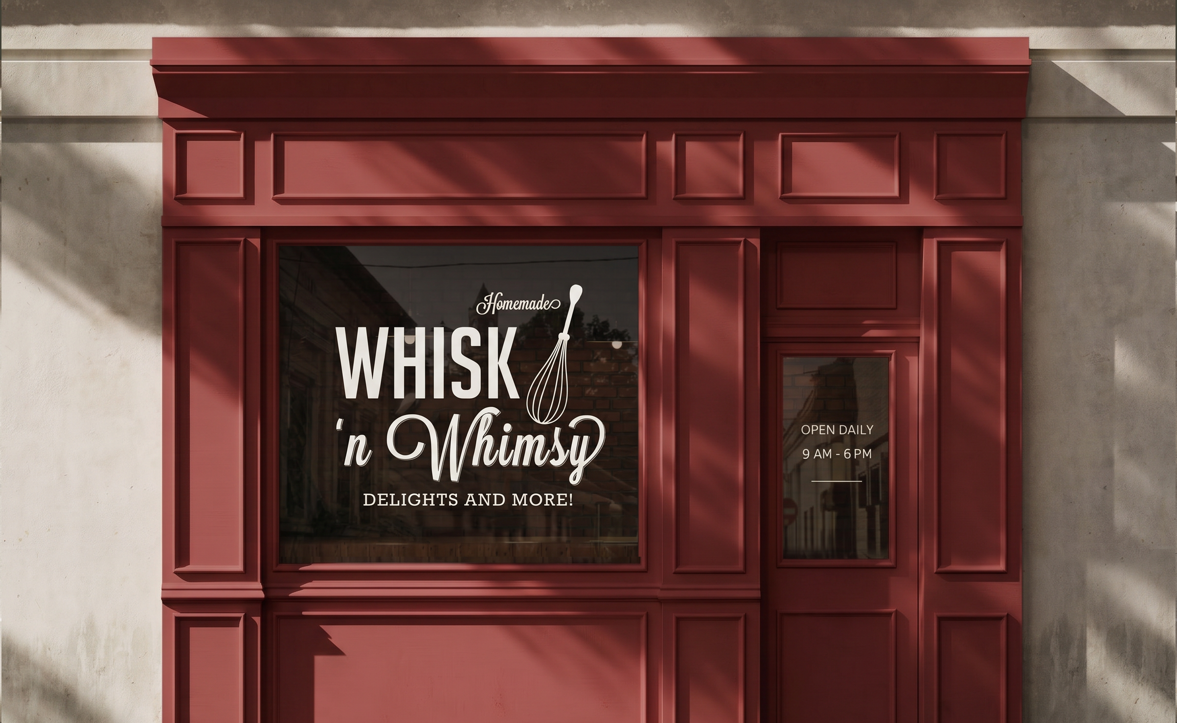
Whisk Baker Brand Overview
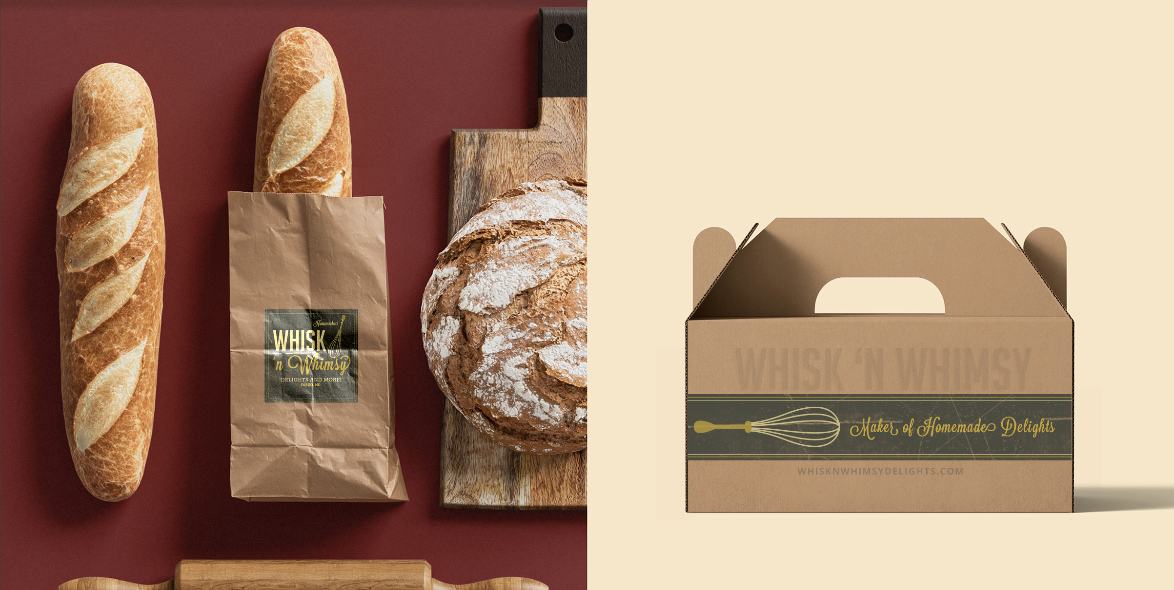
Whisk brand was a 2015 project I was able to design for a friend starting a cottage home bakery. We explored different styles and wanted something classic yet spoke to the word “whimsy”, and leaned into the then popular yet somewhat timeless “vintage branding”. We decided on a badge style direction, with a strong type pairing that used a large condensed sans serif, and the whimsical script typeface. The badge direction brings with it a lot of history for its use in letterpress and lithography, Victorian commercial printing, but also that early 1900’s product labeling that carries a lot of trustworthiness and flexibility. Combined with organic papers and textures, as well as light and dark warm color values, the brand has a high comfort level in both casual and formal contexts.
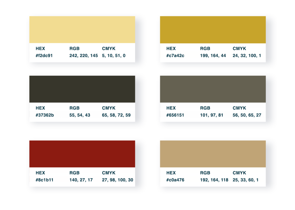
Brand Colors
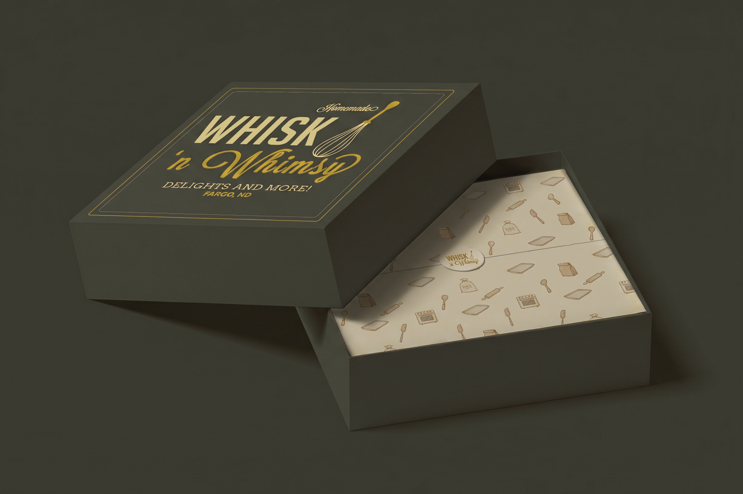
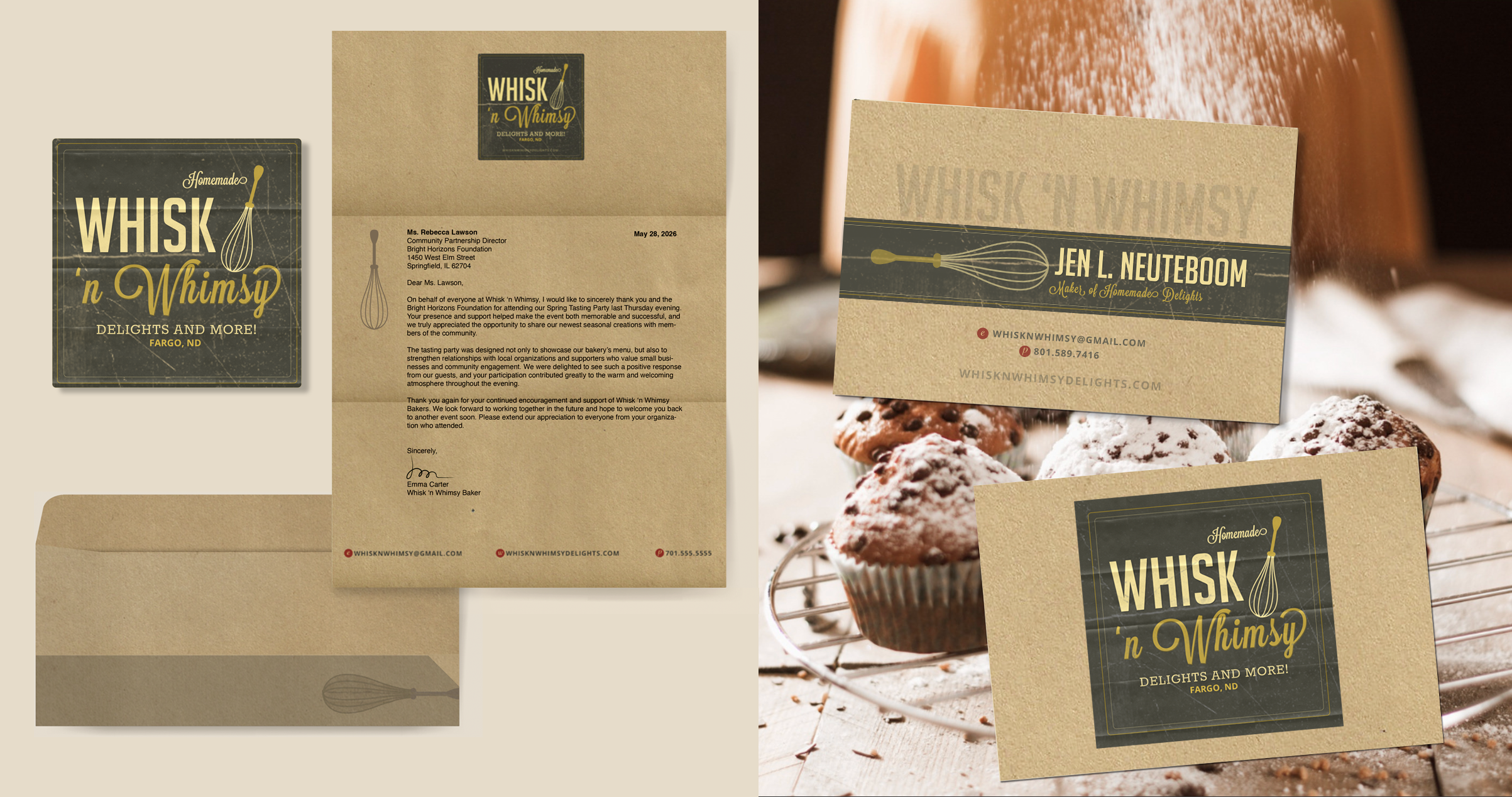
Warm tones dominate Whisk’s base branding, but provide a wide range of light and dark opportunities, which can be seen in packaging, stationary, and social contexts.
Social Posts
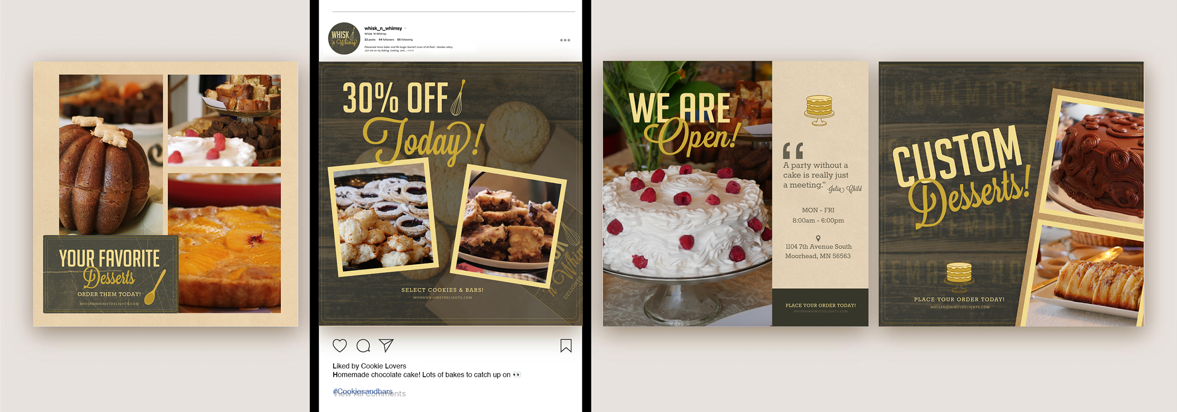
Leveraging photos I took at the Whisk tasting party, I ideated Instagram posts that promoted the brand identity.
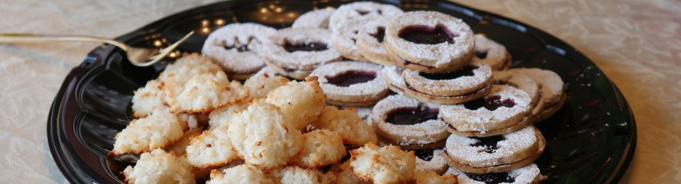
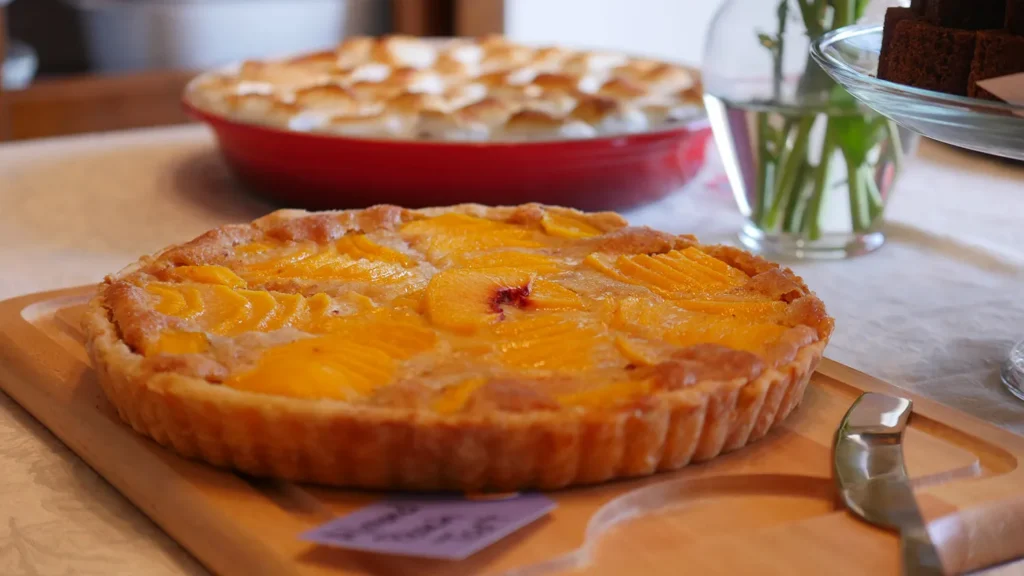
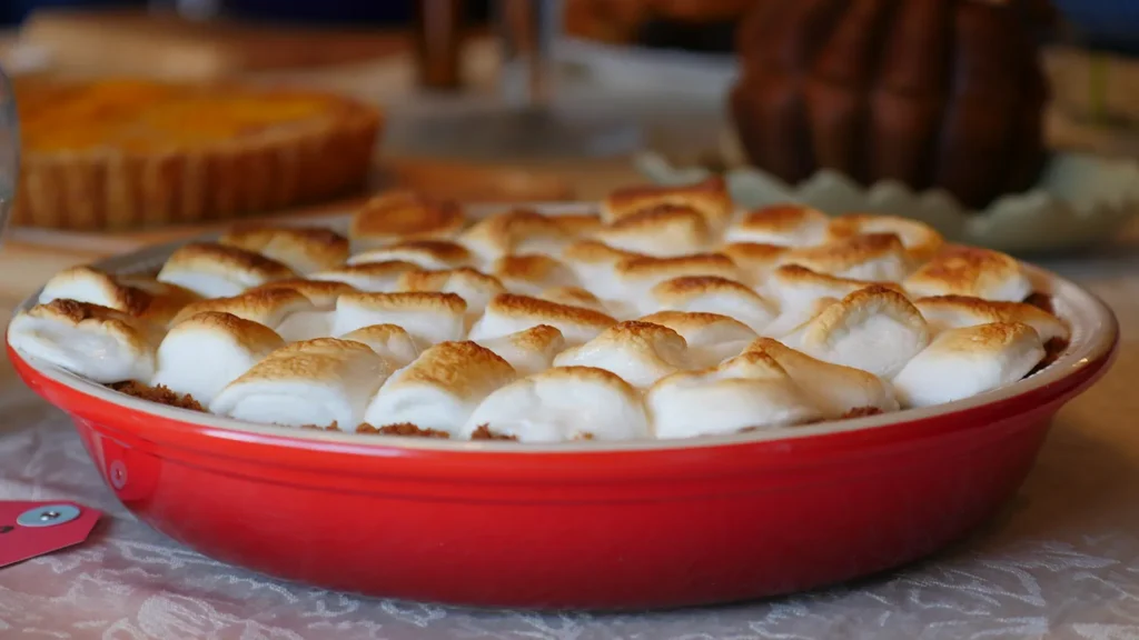
Photography
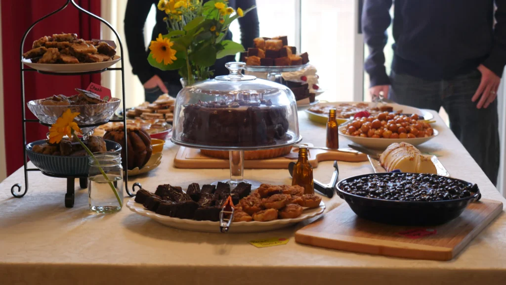
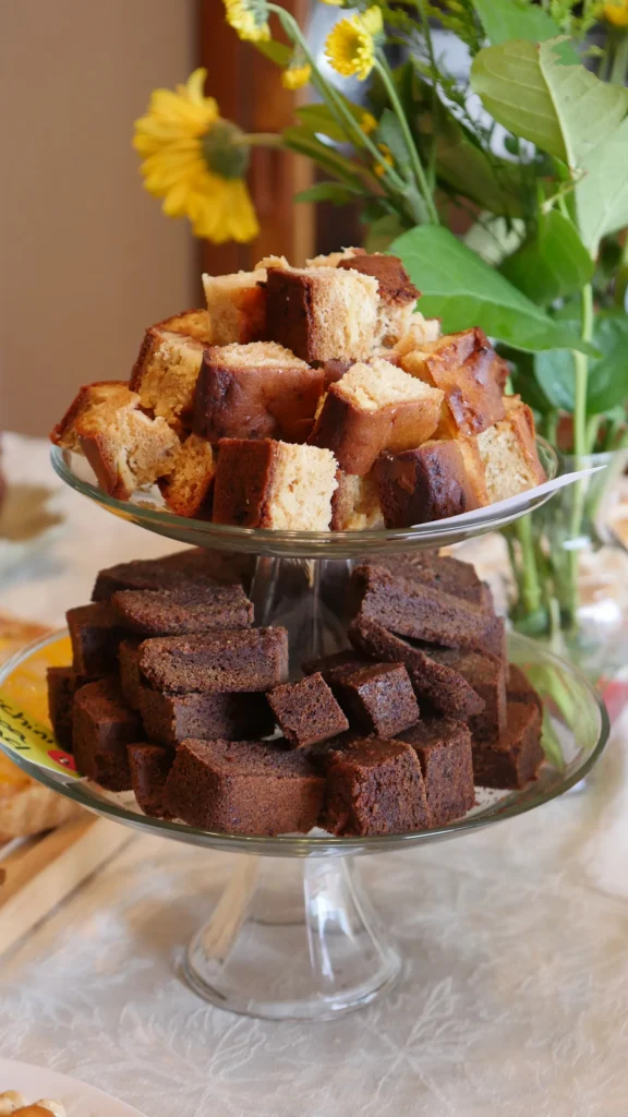
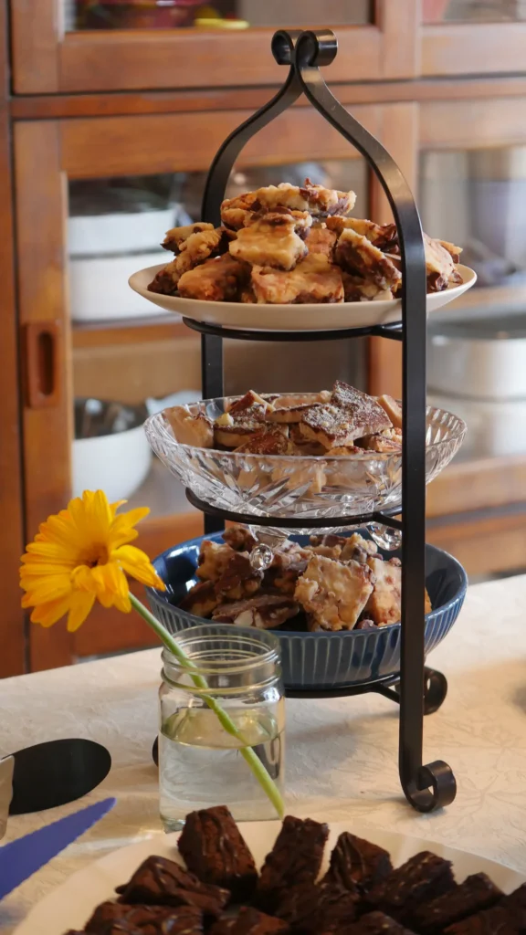
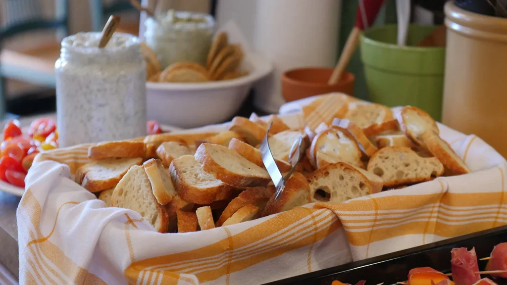
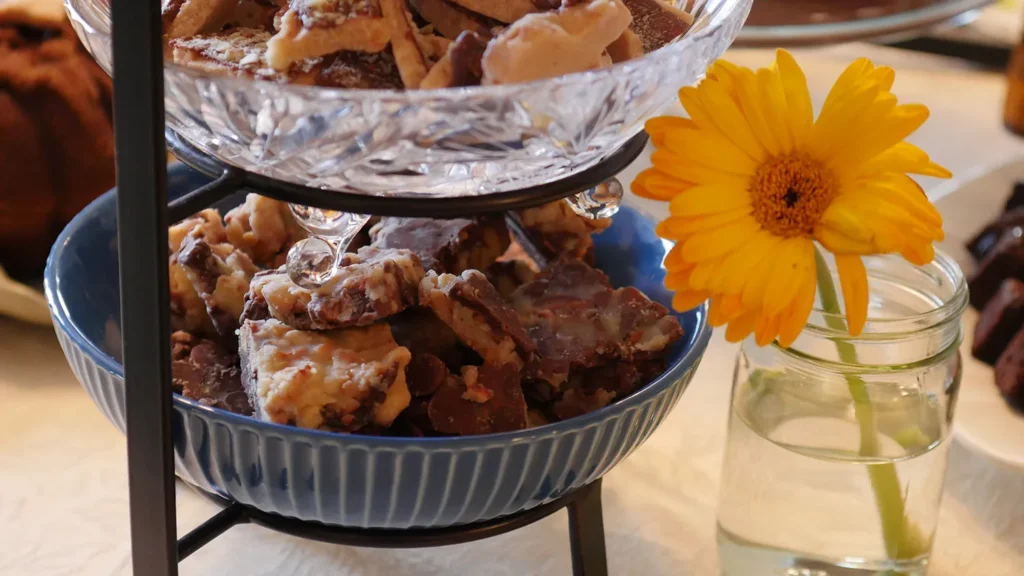
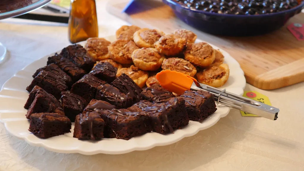
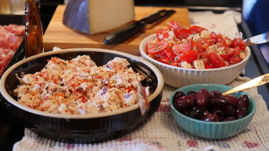
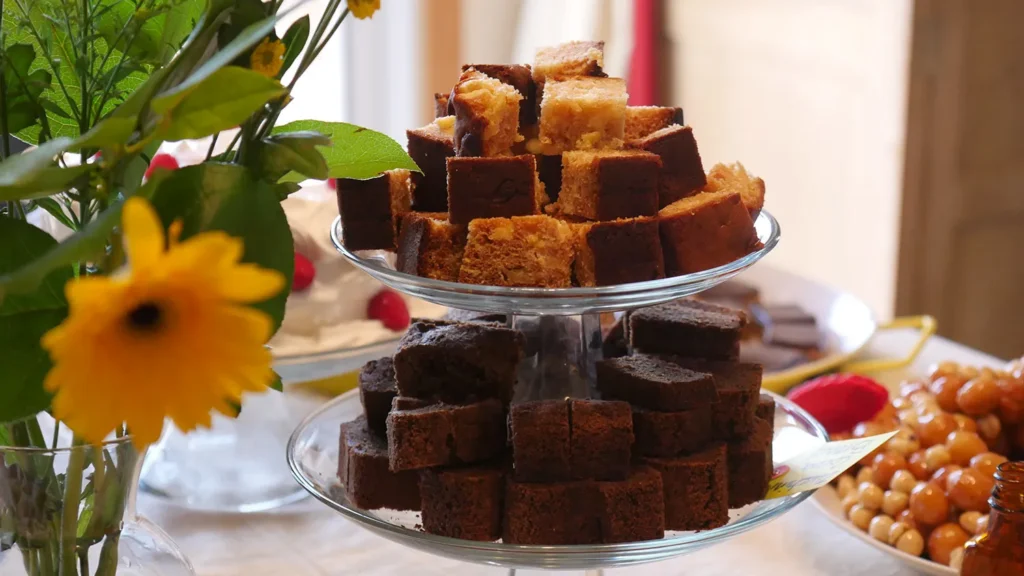
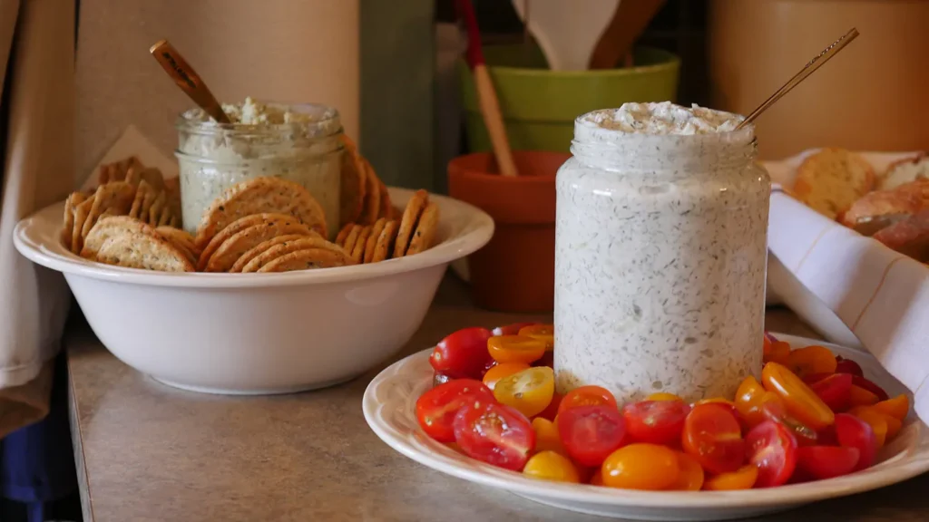
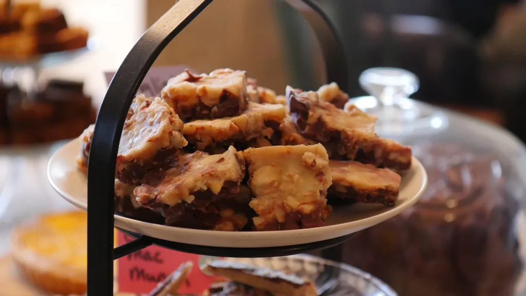
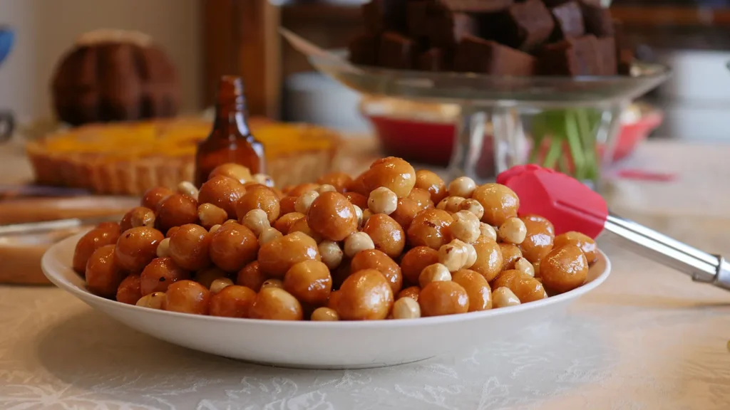
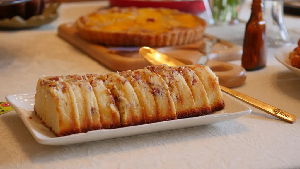
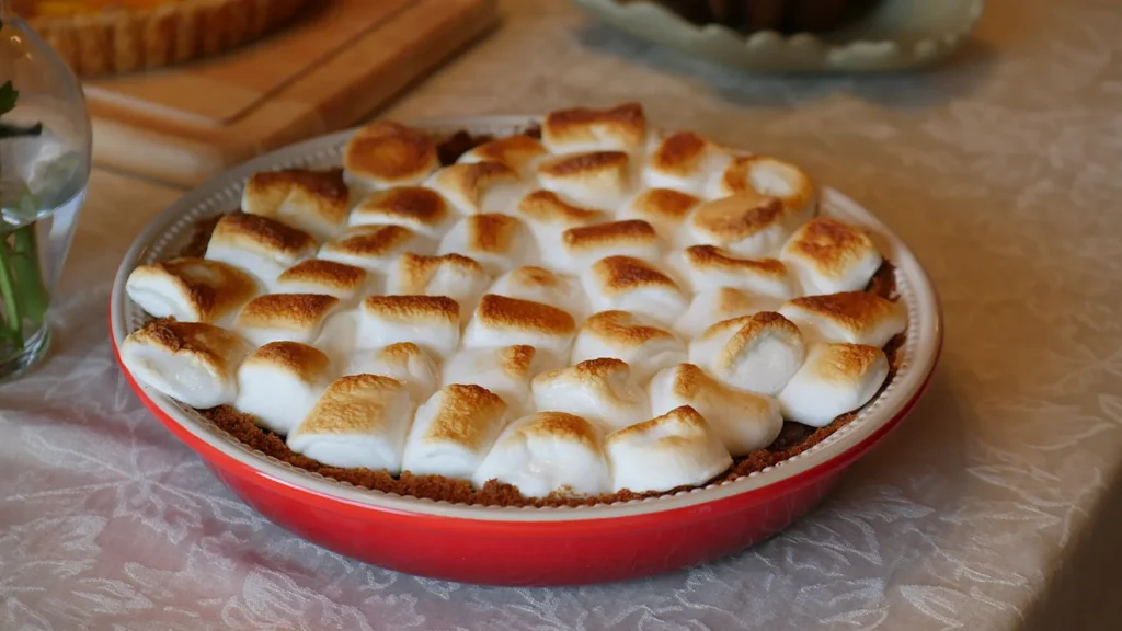
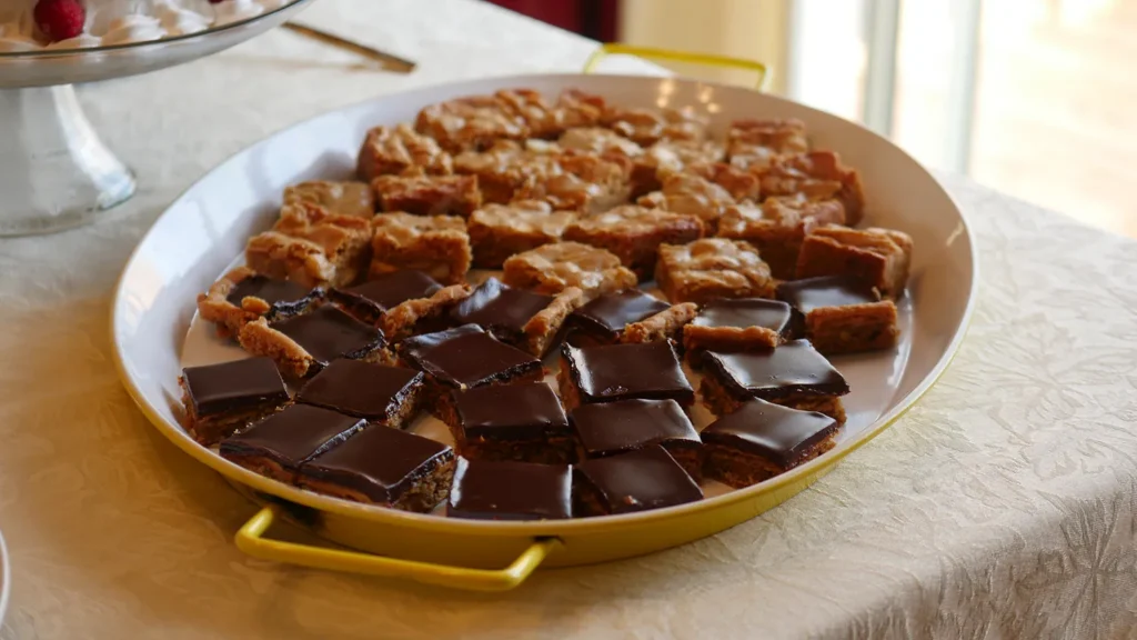
The Whisk tasting party provided a beautiful array of desserts that were a pleasure to capture.
Additional Icons
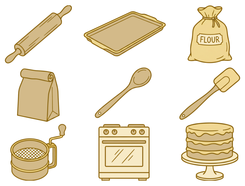
While the main logo icon is a sleek vector art style whisk, additional icons were needed for supporting materials that would work at a smaller size. These are stroked have a simple illustration style. As noted below, I used Openart.ai to assist in icon creation.
AI Acknowledgment
I acknowledge the use of Openart.ai to generate bakery icon forms and some mockup backgrounds for this project. All final colored vector art and graphical compositions were executed by the human designer.